Leonardo rebrand
Building the motion language
The Brief
Leonardo's rebrand needed a motion system, not just a static mark. The brief covered two connected pieces: an identity sequence that could construct the new logo from first principles (line, circle, cube) as a standalone brand asset, and a kinetic typography reel that translated the rebrand's voice into fast, confident motion for web and social. Together they had to establish how the brand moves before any campaign work could build on top of it.


Constructing the mark
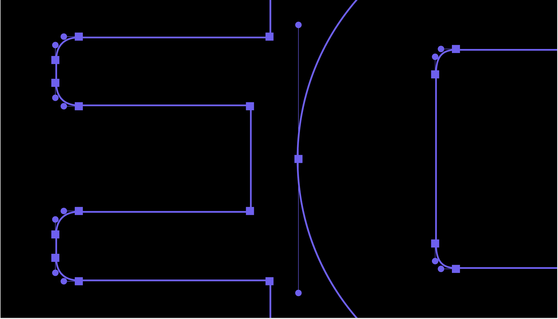
The logo sequence builds the new identity geometrically on screen: circle, square, and cube resolving into the final mark, treated as a piece of construction rather than a reveal.


A voice in motion
The recap reel takes the same rebrand and turns it into type: bold, high-contrast kinetic sequences built around the brand's own language, "create," "make," "stories that connect." Paired with quick-cut social and web snippets, it gave the rebrand a consistent rhythm and pace to be reused across every touchpoint, well beyond a single hero film.


Credits
Leonardo Creative Team, Koto & 10kR
View More.
Check out other Moving Pixels motion work!